How To Use Charts (Graphs) in Google Sheets

Charts, also known as graphs are a popular way of presenting numerical facts and figures. Charts belong to the category of visual data representation. They are preferred due to their ability to portray information in a summarized, digestible, and compact way. It is much easier to notice a trend in the data represented through charts rather than to make sense of it in scattered textual or tabular form.
Google Sheets is one of the most popular cloud-based spreadsheet apps from Google. It is an important free alternative to classical spreadsheets apps such as Microsoft Excel. In this article, I will show step by step how can you use “Pie charts”, and “Horizontal Bar charts” in Google Sheets to represent a simple set of data of monthly expenses. Although the thought of using fancy charts to represent data in Google Sheets might sound intimidating, it can be performed in a few easy steps as given below.
Inserting a Pie Chart
Step 1: First launch “Google Sheets” and start with a blank page.
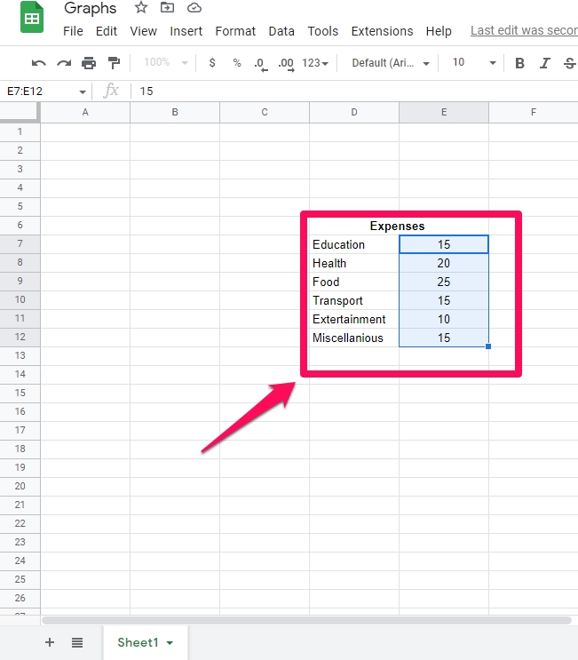
Step 2: Type a simple set of numerical data of your own similar to the data shown in the reference figure.
Step 3: Select the data in the spreadsheet that you want to represent in the chart. For example in my case, the data range is E7 to E12.
Step 4: Click on the “Insert” menu in Google Sheets and then click on the “Chart” option in the drop-down menu.

Step 5: You will notice that by default a “Pie” chart has been inserted for your selected data showing the contribution of each individual expense category in percentages to the overall total expenditure.

Step 6: Google Sheet might display the inserted chart over the data in the sheet. If so select the chart by clicking on it and then move the chart aside to an empty space in the sheet to reveal the underlying data.
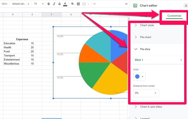
Step 7: If you want to change the look and feel of the inserted chart. Then double-click on the chart and select the “Customize” tab and do changes accordingly.
Inserting a Horizontal Bar Chart
By default, Google Sheets supports the direct insertion of the “Pie Chart” only. If you need another type of chart such as the “Horizontal Bar Chart” then you will have to first insert a “Pie Chart” and then convert it to a “Horizontal Bar Chart”. To do so just follow the following steps.
Step 1: First insert a “Pie Chart” by following Steps 1 to 6 as in the previous section.
Step 2: Double-click on the newly inserted “Pie Chart” to open a new “Chart Editor” window to the right of the screen with two tabs “Setup” and “Customize”.
Step 3: To convert this chart into the “Horizontal Bar Chart” click on the “Setup” tab.

Step 4: In the “Setup” tab window click on the drop-down box under the “Chart Type” category.

Step 5: Google Sheets will give you some suggestions regarding the different types of available charts. You can scroll down and check other types of charts as well.
Step 6: To insert a “Horizontal Bar Chart” click its picture in the Google Sheets suggested list of charts.
Step 7: You will notice that your earlier inserted “Pie Chart” has now been converted into a “Horizontal Bar Chart”.

Step 8: If you want to change the look and feel of the inserted chart. Then you can do that from the “Customize” tab.

Wrapping up
Charts are integral for presenting data graphically. Google Sheets provides an easy and intuitive way of including charts in your worksheet. One noteworthy thing is that Google Sheet does not allow other than the “Pie Chart” to be inserted directly. Therefore, if other types of charts are needed then the user must first insert a “Pie Chart” and then edit it to change it into the desired chart. Several aspects of the inserted chart can be changed from the “Customized” tab in the “Chart Editor” window.